Screen Shots of iWeb Content


WIP Update 1 - Test experiments for E4 Opening sequence


iWeb Schematic

This was my initial idea for my iWeb schematic. This helped me to understand the order the pages and link would need to be in.

Countdowns

After looking at the brief again due to so much confusion between different tutors telling different people things about the countdown brief and whether or not to include numbers in the opening sequence or not, i have decided to change my opening sequence to include a countdown. I have looked at a few countdown sequences on youtube to see what is already out there and i have chosen a few that i think will are quite relevant to my projects content and some i have chosen just because i find them interesting.


Math talk!

I can't believe this was on T.V in 1995! it looks so much older!! The only bit i was really interested in was the beginning transition from the telephone numbers to the equations and maths visual language.

I Ching/RNA Descending sequence

This video looks similar to what i want to do with my spirograph design in my animation. It goes on a bit long but i like how they transition from one pattern to another.

Ongoing Evaluation

Have you looked at the competition/existing work? How has this informed your decisions/design direction?
I have looked at competition and others existing work in relation to patterns, maths patterns and animation for ads, stings etc. This has informed my design process as it gives me a bench mark to aim for with my own designs and it has inspired and influenced my ideas.

How broad is your range of ideas and how thoroughly have you developed them?
I have designed my initial idea and then i have developed it to make it more relevant. I have committed to this idea and will try to develop it further to make it work to my advantage.

Have you considered colours/reverse out, weight of marks?
I have considered colour, and i chose red and white because while creating my 'mood board' i generated imagery i thought was associated with maths and this was things like white squared paper that you have in maths books or red marks when something was correct/incorrect. I wanted to create a quite educational feel to my idea and i thought these simple colours would portray this.

What are your aims and objectives? What are you trying to communicate and to who?
My aims and objectives are, to effectively communicate 'maths' 'patterns' and an educational feel to designs. I am trying to communicate that my programme is an educational programme with a bit of a twist, using patterns to show that maths really is interesting and useful.

Is your design work meeting your aims and objectives?
At the moment i think my design work is not meeting my aims and objections fully, but i intend to include more visual imagery to my idea that will hopefully remedy this.

Do you completely understand your message, product, target audience? If so, how has this affected your design work? If not, how can you address this problem?
I completely understand my message and target audience (12 - 16 year old children at high school and don't find maths interesting or relevant) This has effected my design work as i have been designing with educational programmes in mind. I wanted to try and get the feel of an educational programme for an uninterested viewer from my target audience, and to capture their attention to want to know more.

Have you thoroughly explored the potential and tested the possibilities in your research and development before committing to a final resolution?
At the moment i don't feel i have fully tested my idea enough and developed my idea enough to commit to a final resolution. I need to do this ASAP.

How well have you planned your time so far/Have you made the best use of the facilities/staff and studio time?
I haven't made the best use of the facilities available yet and this is what i need to do to test my ideas and see how they work.

What time have you set aside for technical problems, testing etc??
I have set aside a few days before the deadline to test everything and resolve any issues with my animation or iWeb. (even though i have been testing things like my iweb, every so often so i don't do a massive amount and find out it doesn't work)

Final Spirograph 0-9

Sanna Annukka


Fashion/Brand patterns

While looking into patterns how could i not mention fashion designers patterns such as gucci, Louis Vuitton and the good ol' favourite burberry (yes, that's sarcasm!) These patterns have helped brands become easily recognised and have become what most people find attractive from the brand. Wearing one of these patterns could even influence peoples perceptions of you, either good or bad....


GUCCI


LOUIS VOUITTON


TAKASHI MURAKAMI FOR LOUIS VOUITTON


BURBERRY


You even have patterns like tartan and houndstooth which are classic patterns that most people would recognise.


Some of my repeat patterns...

Below are repeat patterns that i have created using some of my Spirograph inspired patterns.


The images below are some really simple designs using cyan circles.


Moving patterns - Modular Origami

I haven't done any origami for ages, but i got bought LOADS of origami paper for xmas so i decided to incorporate it with my current brief. I decided to make something called an origami firework, which is an example of modular origami (origami that incorporates several identical pieces to make a whole model) to show a 3D pattern in motion. Below are the images of the firework i made, I'll try to make them into an animated gif later to show the movement better or upload a video of it.


An amazing little toy

click HERE to play.

Kaleidoscope patterns

I found this video of Kaleidoscope patterns and i thought it would be good to reference as it could be something i could adapt and use my illustrator Spirograph patterns to do something similar in After Effects.

After Effects Pattern movement

I really like how the video below shows movement and how the argyle pattern is built up over time. I would like to try and experiment with this using my Spirograph alphabet or Spirograph inspired patterns.

Spiromania

Spirograph Adverts

Spirograph advert from the 1960's


Spirograph advert from 1973


Spirograph advert from 1992 - Oh My!!

Spirograph Animation

I found this video on Youtube and thought it was quite interesting in relation to my pattern research as it shows how Spirographs can change and the variety available from a the same shapes.

of paper and thread

I have followed of paper and thread for a while now (a blog by a west-Australian based designer) and i found some of her patterns that i find quite interesting in relation to my pattern research. I love the colourway of gray and yellow together and i think the circles made of circles are quite interesting too.


print & pattern

I contacted bowie style of print&pattern, a blog i regularly read, and i asked her what/who her favourite 10 patterns/designers were of the moment and to explain why. She replied quickly and even included images of the patterns she mentions! Thanks bowie style! Below is the reply she sent me:

"im not too good with words but ive chosen 10 designs i really love at the moment....

1. orla kiely stem print
"an absolute classic, simple yet colourful, perfect geometry, no fuss yet busy"
2. caroline gardner
"i love the use of bold colours set against dark backgrounds"
3. petra boase's love prints. (on mugs in this shot)
"the perfect mix of vintage pattern and typography that set in the right way looks contemporary"
4.helen dardik
"helen's patterns have a spontaneous hand drawn sketchy look even though they are digital"
5.michelle romo
"one of my fave designer/illustrators - i was amazed to learn she draws everything with a mouse !"
6. ecojot
"there have been owls of every type and size over the couple of years - and these were the best example i had seen"
7.lotta kuhlhorn
"what i seem to like about a pattern is geometric shapes and unusual colours - this has both"
8. sukie alphabet
"the handprinted gocco look, and i love decorative fonts and type - good colour combo too"
9. designers guild
"one of the few patterns i love that isnt digital - its hand painted yet still v.contemporary"
10.julia rothman
"julia is one of the best new pattern designers in the US, she has a slight vintage feel but sells to cutting edge shops like urban outfitters."

hope this will be useful for your project : )

good luck with everything and thankyou for reading P+P !

regards
bowie"

Book Layout design, Composition and Number Patterns

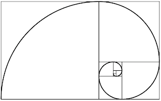
As well as looking at patterns using imagery i have looked at the Fibonacci number sequence and how it relates to the golden ratio. In the Fibonacci sequence the first number of the sequence is 0, the second number is 1, and each subsequent number is equal to the sum of the previous two numbers of the sequence itself, yielding the sequence 0, 1, 1, 2, 3, 5, 8, etc.

The Golden ratio is a way of laying out composition and ordering things in art, design and nature. In mathematics and the arts, two quantities are in the golden ratio if the ratio between the sum of those quantities and the larger one is the same as the ratio between the larger one and the smaller. Many books produced between 1550 and 1770 show the proportions of the golden section exactly, to within half a millimetre.

Zeising wrote in 1854:
"The Golden Ratio is a universal law in which is contained the ground-principle of all formative striving for beauty and completeness in the realms of both nature and art, and which permeates, as a paramount spiritual ideal, all structures, forms and proportions, whether cosmic or individual, organic or inorganic, acoustic or optical; which finds its fullest realization, however, in the human form."


http://en.wikipedia.org/wiki/Main_Page

Sewing Experiments

The following images are experiments using thread and paper to create a mathematical pattern. I can't remember what its called but i bet you all did them at school, i know i did! I tried them on graph paper but i wanted to see how they would look 3D and i think they create even more interesting patterns.


The image below is a larger version of the sewing experiment using A2 paper and teal thread:


Want to create your own Spirograph pattern??

Then visit this website and have a play! Heres one i did:

Fractals?

The image below is a fractal. It is a pentagram made up of pentagrams which are made up of pentagrams etc. you could zoom in on this pattern and it would be made up of the same pentagram and would produce the same patterns.


I don't know what these patterns are but i think they look like fractals too (or sections of them) . They look like ink squirted into water or really fine roots growing out, whatever they are this is another pattern formation that i think is really interesting, as fractals have a shape that is repeated numerous times within that shape to create more interesting shapes. Here is a video to explain it better.....


17 wallpaper groups

I really cant describe this theory or method of making patterns but if you asked me to do it i could. This website is really useful to help understand and create your own patterns. If i have enough time i will try and create some patterns using the info from this website. It has some really easy to understand animations that are quite an interesting easy way to show how to make the patterns and how they look once completed. Obviously you can choose your own shape or design for the patterns, these are just used for simplicity and ease of viewing. You can rotate by 180,120,90,60 degrees, reflect horizontally or vertically, glide horizontally or vertically and change where you do all this from: either the center or a corner for example.

Xmas Brief Update

For my Xmas brief i have decided to focus on patterns. I have wanted to look into how to make patterns for a while now, and as Lorenzo said, I should choose something I'm interested in but don't know a lot about so i can learn something new. I have started researching into patterns on the internet and websites that keep coming up all mention 'The 17 wallpaper pattern groups' they seem pretty simple to understand but are explained in really confusing mathematical ways and strange diagrams. Once I've created my own pattern for each of the 17 patterns ill upload what i think are the best. The brief is about the best/worst and i would like to focus on the best patterns but i don't know in relation to what or how to judge what is the best or what makes a pattern the best....anyway...

Ive been exploring Spirograph designs that I've always been interested in and below are examples of illustrator patterns I've created that have been inspired by Spirograph. I also have examples in my sketchbook from an actual Spirograph toy but for the patterns below i have taken various shapes such as triangles, squares, circles and variations of pentagons, hexagons, heptagons etc etc....


As i am also interested in typography and my new favourite font is times new roman, i thought i would try and create spirograph inspired patterns using this font.


(the reason they are a light cyan colour is because when i started experimenting with the Spirograph patterns i did them on graph paper and that was the colour of the lines on that. I thought it looked interesting and i kept the colour when i took them into illustrator!)

Xmas Brief

I thought it was time to upload something from my xmas brief but i will just give a sneak preview before everything is complete. Here is what I've been working on...


interactive media

Interactive media is a really interesting fun way to involve people in the action of design. While in Japan on holiday i came across a huge wall like this but it was like a huge white board in the business district and it projected patterns created by peoples movement and speeds infront of the screen. The wall below is similar.